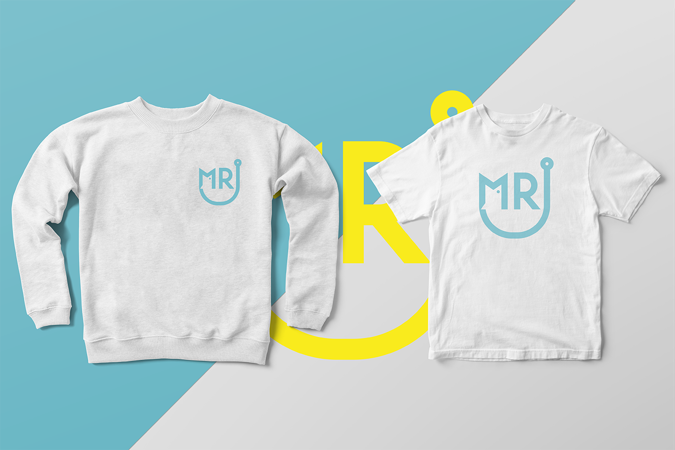
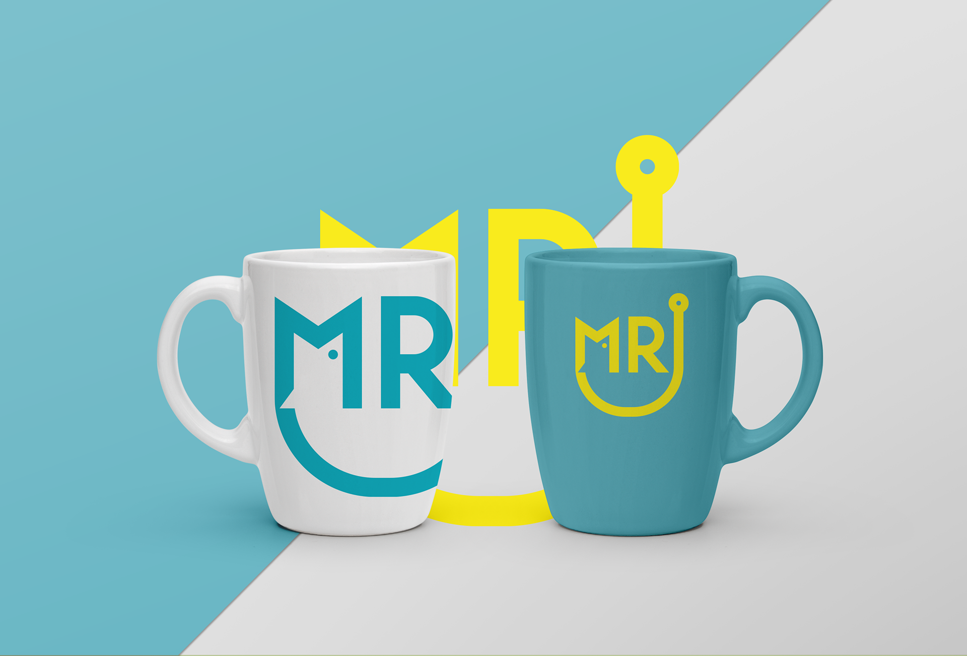
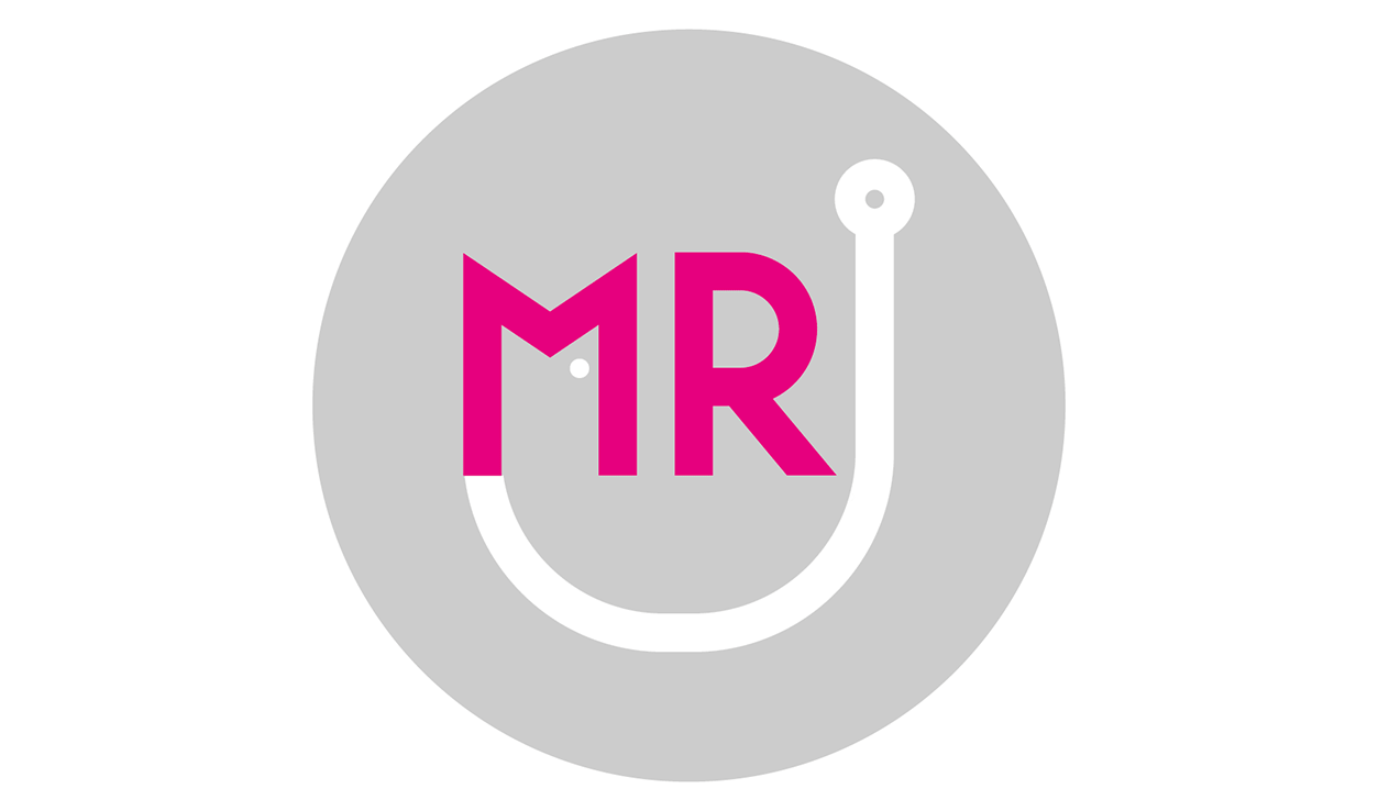
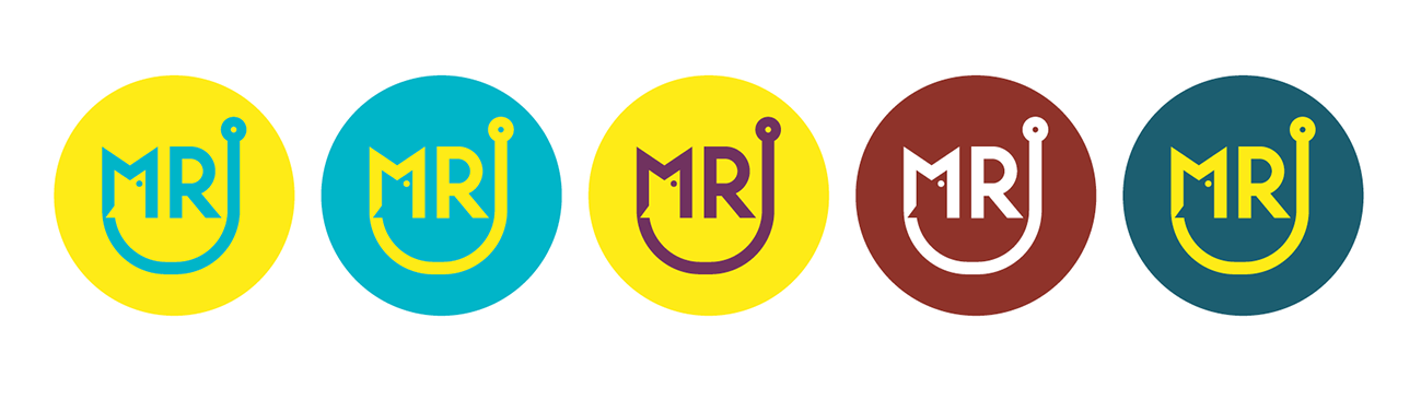
This project for MR Baits was a very nice one. I was relatively free handed in doing a brand logo for them. So I took the first names of the founders. Which goes by Michael and Robert and integrated it into the logo seen above. I played a lot with forms and shapes and got quiet quick to a hook, a fish, and their initials. Due to the fact that this small company produces fishing baits, the logo has everything combined wonderfully together. To build a strong brand identity which stands out in the world of fishing and has a pretty high wort recognition and good contrasts that it is easy to recognize no matter what size it fits in. I used no font here, the initials are made from scratch.